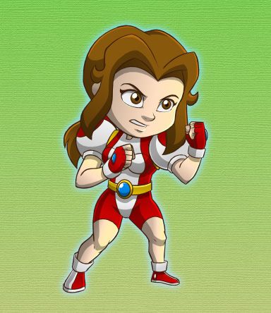
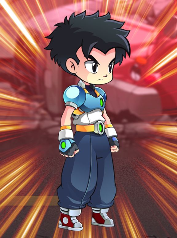
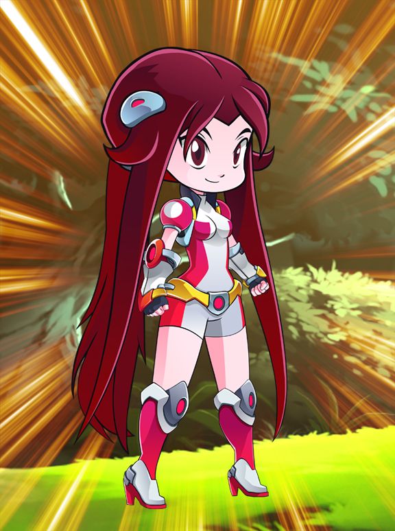
There are a number of visual improvements to help market the property. Sometime in 2010, our broker suggested that we cover the cleavage of our female character – Jessalaine , this is so that we can market the property in Muslim countries. But for the local audience and Western veterans in the industry, the cleavage was even an asset to add flavor or character to the cartoon. But our target market is primarily the developing world, so its okay for us to cover the cleavage and besides if ever there is a live TV series or live movie in the future, the new design will prevent any wardrobe malfunction. Since we already produced some full episodes then, we had to redesign and redraw the garment to cover the cleavage.


As we refined our concept, the title and typography followed. Before, we just relied more on the aesthetic look of the typography. It was only in December 2010 that I thought of the complete title – a kind of a eureka moment for me while I was jogging. But it was a bit too late as we submitted the pitch bible with Jobert as the title – just a week or two earlier. It took about a day or two to decide which title to use among 4 alternatives I thought of, with the help of our broker. Our broker suggested the title be Jobert and the Crop Circle Warriors since it covers everything.
But even in late 2011 we were not sure what the official title would be as we were still vague with our concept; we were thinking we could use one title for the local market, while another one would be used for the foreign market. Deciding on which title to use is difficult, on one hand we are leaning on a shorter title – ‘Jobert’ like ‘Naruto’. On the other hand, there are few famous classic cartoons with a long title like ‘He-Man and the Masters of the Universe’ or ‘Josie and the Pussycats’. It was only upon the final refinement of the introduction that I am convinced of using the long title. The typography of the long title could be used in any media, merchandise, promos etc. and will look the same all throughout with no problem. Shown below is the evolution of the typography for the title.

The original typography was done sometime in 2008 for 2 posters and one was used as a brochure also for the Hong Kong Filmart Festival. The three orbs represent the three main characters with the corresponding color of their cyber costumes.
The second one was used for the Original Billboard presentation in YouTube. The letter O is also the orb and it will show the glowing crop circle design of Jobert inside it. It was done sometime in 2008.

The third one is the one used for a poster shown above in Dongguan, China in 2011. At that time, we were still not sure of our typography.
The fourth one is made sometime in 2012 when we were already sure of the title to use. The design was not good enough, so it was scrapped.


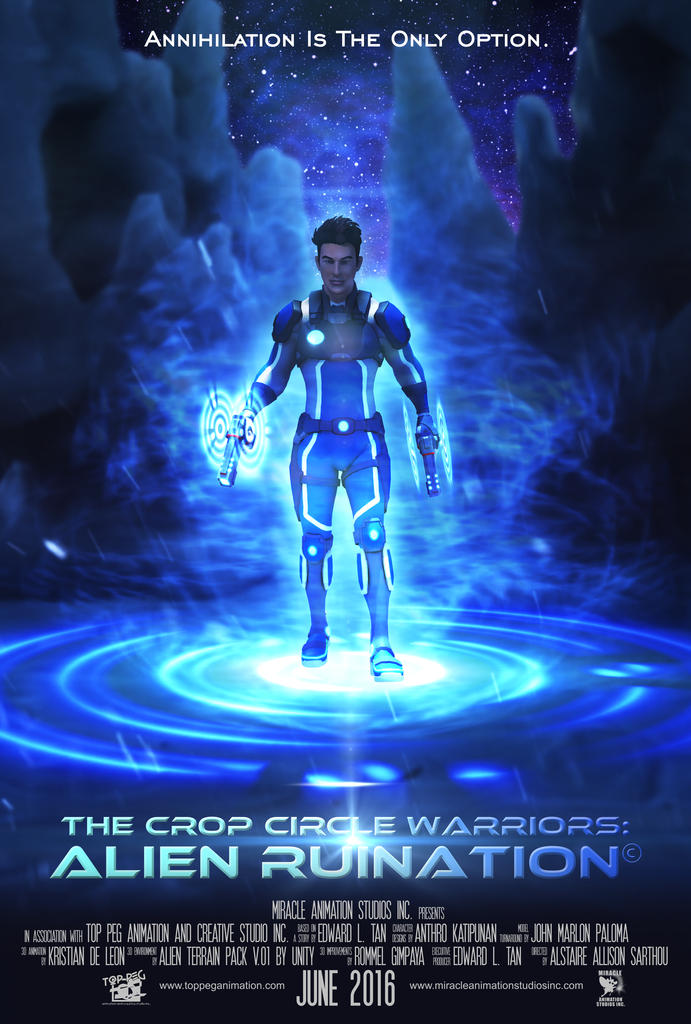
The fifth one is the final design – shown used in the old posters above. We could change the typography to any color or a metallic look, which is shown in the sixth or final row. The new typography is now flexible, it could be used for both cartoon and realistic posters.
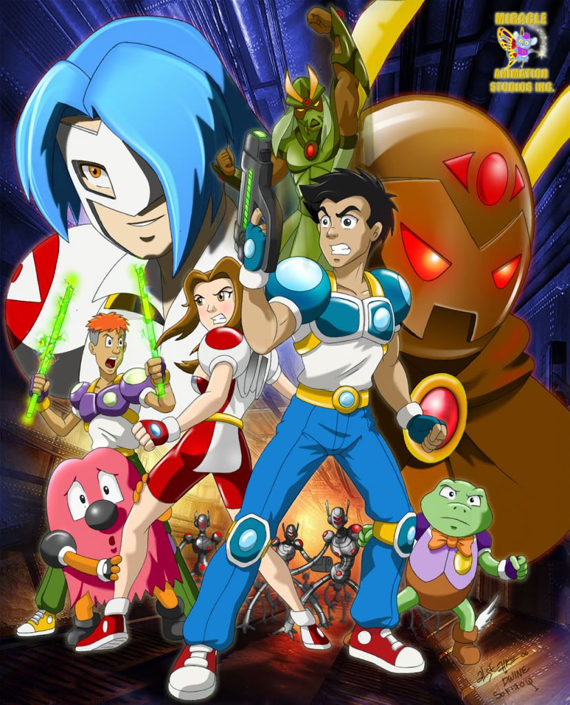
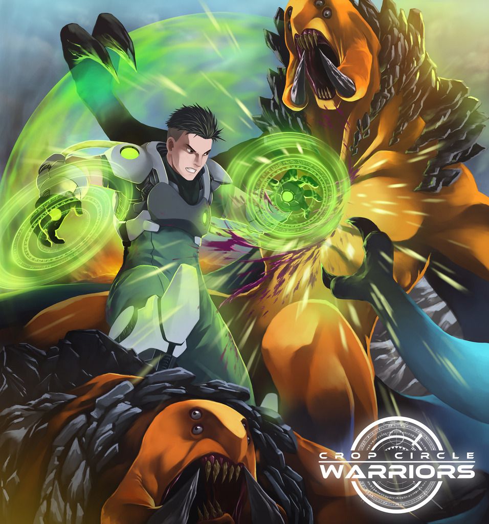
The poster below is a scene taken from the final episode, wherein Jobert had increased his power tremendously. It’s a nice dramatic scene, wherein it captures the essence and the difference of the animation compared to other cartoons. Adding the new typography just makes the art more beautiful.


My partner and I stumbled over here from a
different page and thought I might as well check things out.
I like what I see so now i am following you. Look forward
to looking at your web page yet again.
Thanks for the comments.