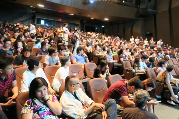
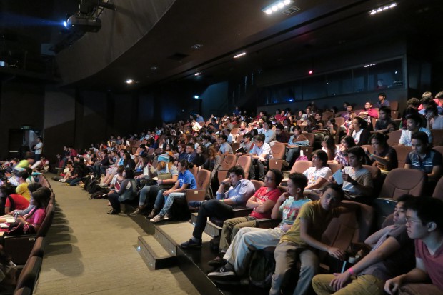
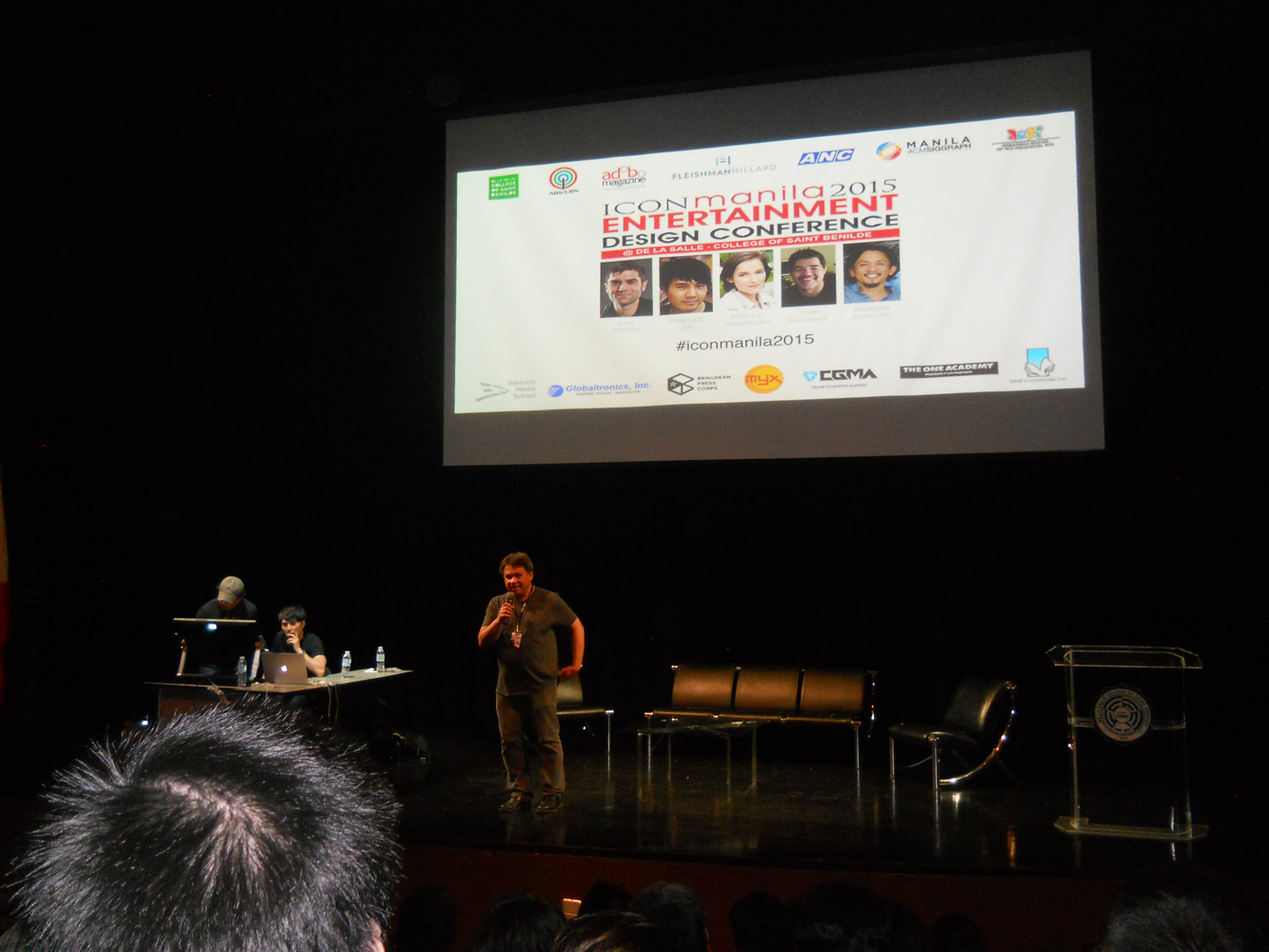
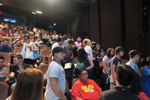
![]() ICON Manila is an international entertainment design conference that was held last June 26 to 27, 2015 at the 5th floor auditorium of the De La Salle College of St. Benilde School of Art & Design Building in Manila. The focus of the conference is on animation in the entertainment industry. The five speakers were from the US animation, game and entertainment industry working with some of the biggest companies producing some of the best known movies, TV shows or console games. This was the second time that the said conference was held in Manila, the first one being held last July 3, 2014 at the SMX Convention Center. The conference was attended by students, professors and professionals from the animation, media and entertainment related fields. The students were mostly from the College of St. Benilde, iAcademy in Makati, Lyceum of the Philippines in Batangas, University of Santo Tomas, University of the East, Far Eastern University and University of the Philippines.
ICON Manila is an international entertainment design conference that was held last June 26 to 27, 2015 at the 5th floor auditorium of the De La Salle College of St. Benilde School of Art & Design Building in Manila. The focus of the conference is on animation in the entertainment industry. The five speakers were from the US animation, game and entertainment industry working with some of the biggest companies producing some of the best known movies, TV shows or console games. This was the second time that the said conference was held in Manila, the first one being held last July 3, 2014 at the SMX Convention Center. The conference was attended by students, professors and professionals from the animation, media and entertainment related fields. The students were mostly from the College of St. Benilde, iAcademy in Makati, Lyceum of the Philippines in Batangas, University of Santo Tomas, University of the East, Far Eastern University and University of the Philippines.
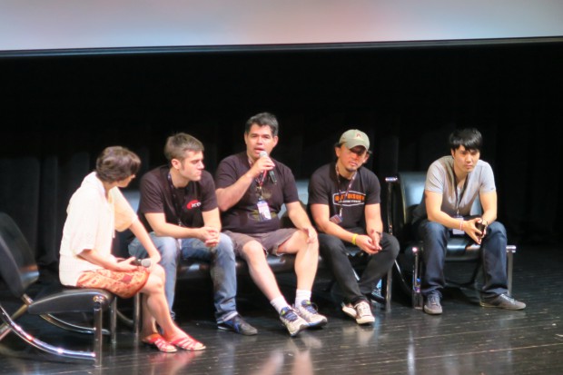
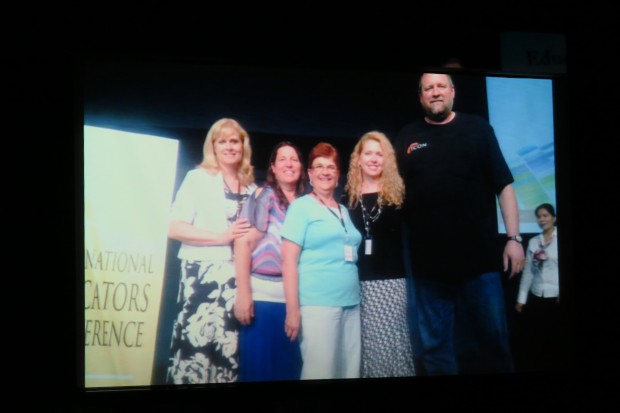
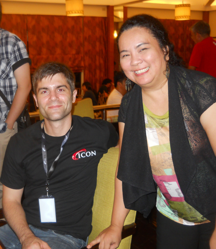
Note: Same as last year, most of the visual and lecture presentations by the speakers are copyrighted – especially the films, games and other projects they worked on; so no pictures, videos or recording was allowed during the lectures. I just took quick rough notes of the talk so I think the content here is not as accurate as the speakers’ explanations. The pictures herein are those that were allowed by the speakers. I (Edward) only attended the June 27 seminar as I was busy on the 26th and the fee was a bit hefty P3,800 for the early bird registration for a day sometime in May; so I asked Grace A. Dimaranan to do the essay for June 26 and supply some of the pictures on that date. The pictures below were all taken on June 27 during the open forum after the lectures.


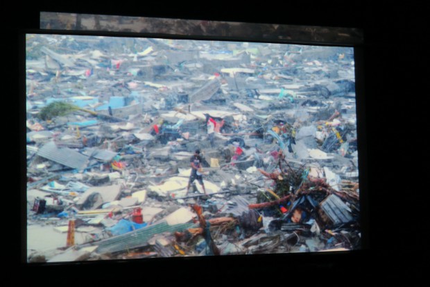
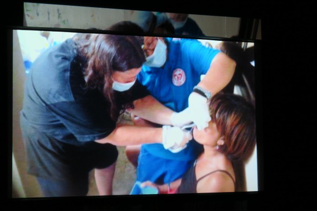
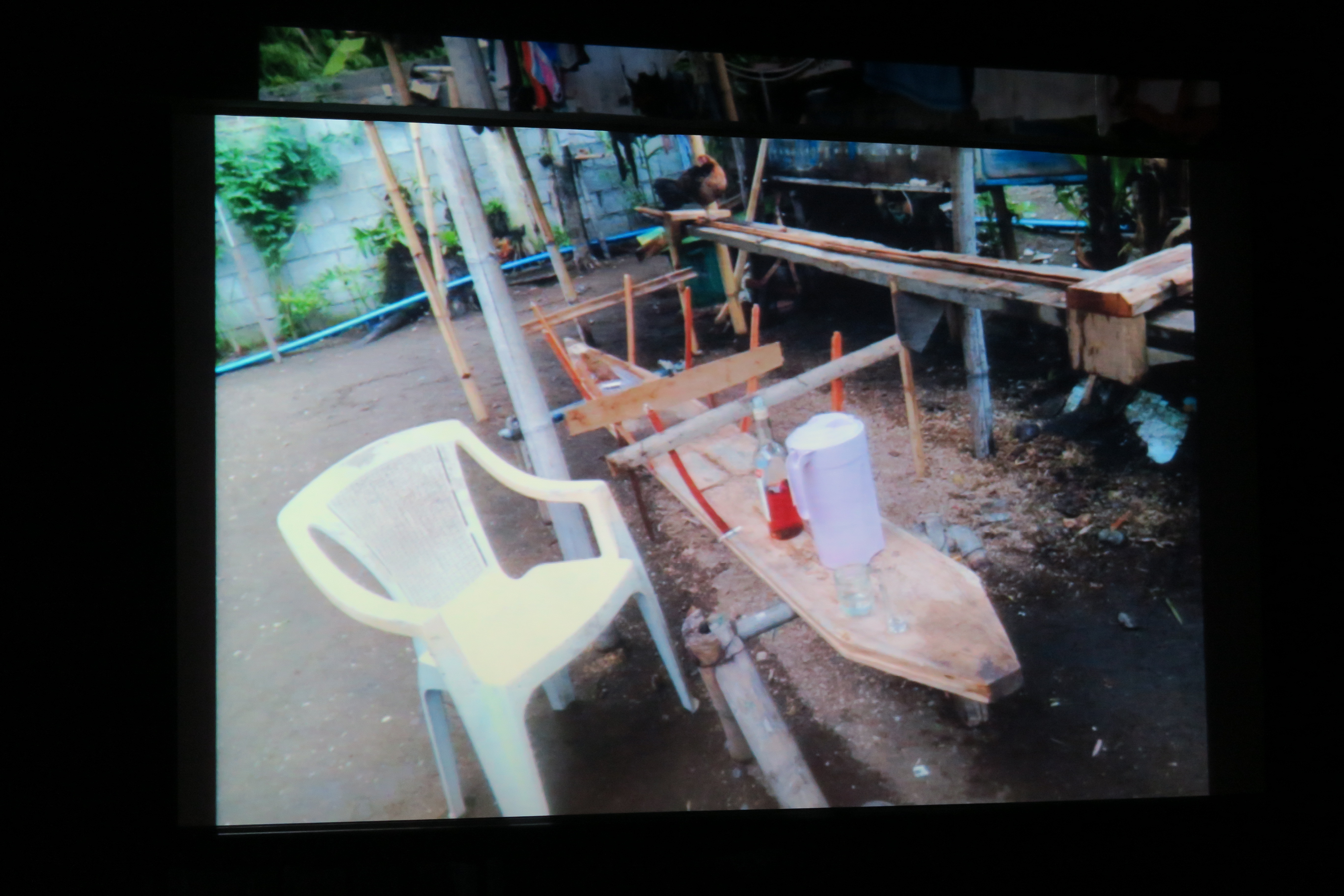
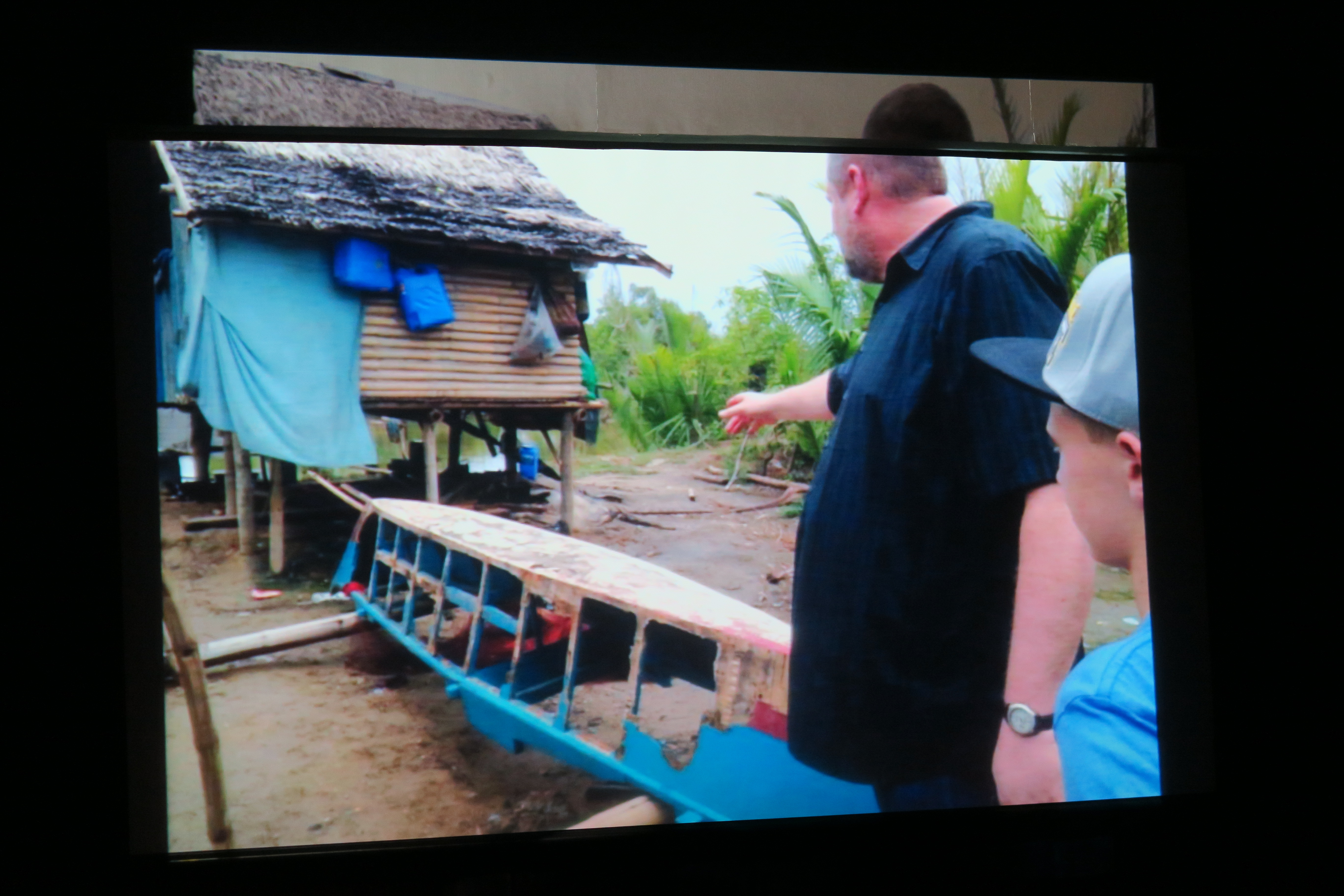
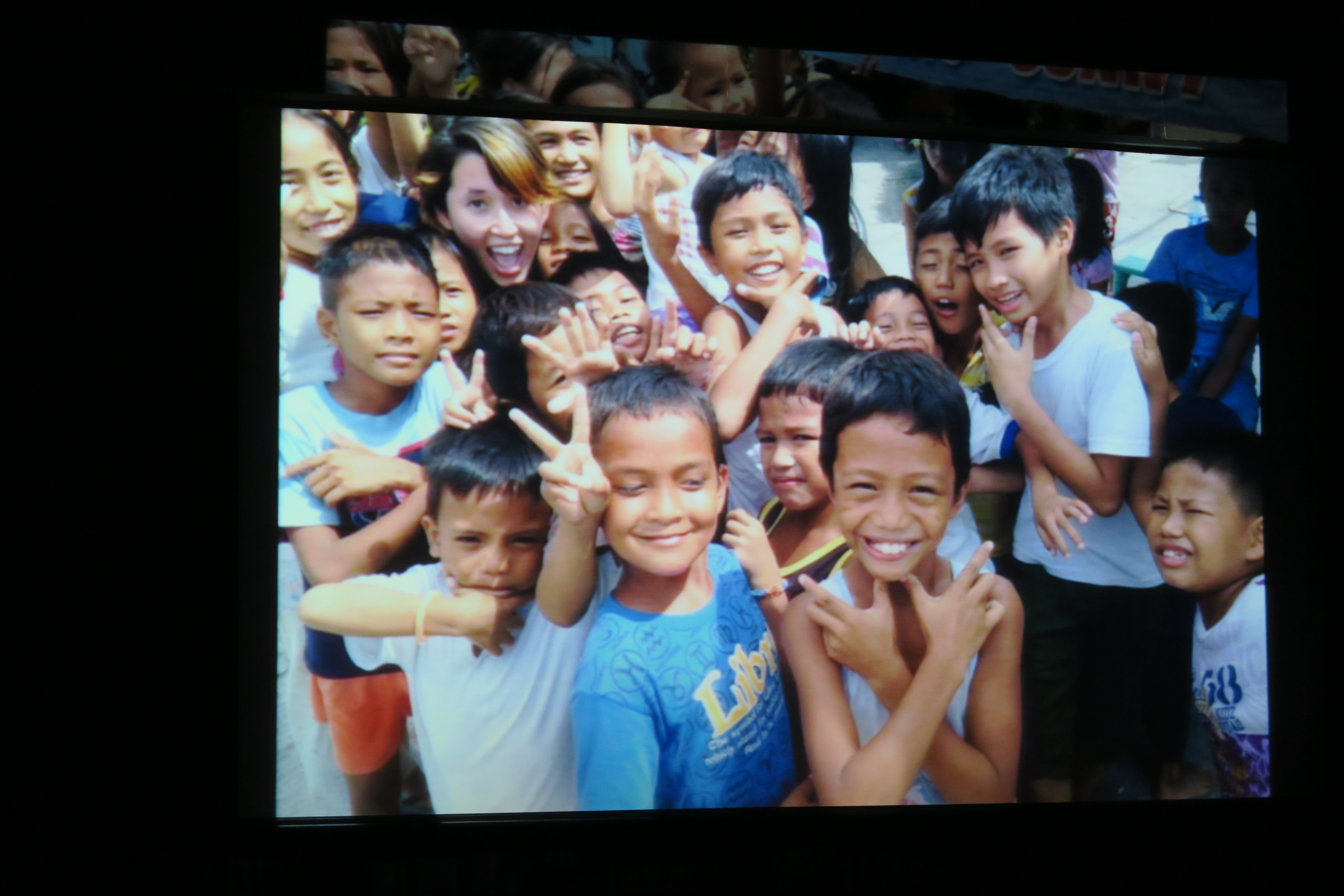
ICON is the brainchild of Mr. Armand Serrano, a Filipino who for many years worked in many major studios and now as a freelance designer in the game and commercial industries in the US. The conference is a way to inform and inspire Filipinos to use their artistic talents and be more competitive. Armand together with his artist friends in the US did some brainstorming on how to help the Filipinos in Leyte and other provinces when typhoon Haiyan struck the country on early November 2013. Since last year, he and his friends gave 1 week of their vacation time to do some volunteer work in the country aside from giving talks in the entertainment conference. After lunch before the 3rd speaker started, Armand showed last June 27 what they did last year and this year to help alleviate some of the many social, economic, religious problems the less fortunate Filipinos in Leyte, Bulacan, Aklan and other areas in the country. They did some informal drawing lessons to the kids, some dental mission, donating their last $500 for a devastated Baptist church in Kalibo, Aklan, played some basketball with the kids, financed the building of a larger fishing boat after all the fishing boats were destroyed, and had an educational teacher conference which is their counterpart for the entertainment conference. ICON Manila is a for-profit event under Icon for Missions, a non-profit organization based in Riverside, California. The entire profit goes back to humanitarian and medical missions in the country.

Leyte

ICON 2014


Devastated Baptist Church Up to Now


June 26, 2015 (9am to 5pm)
I asked Grace A. Dimaranan to write about what transpired on June 26, but she said after reading my essay on the 27th, it more or less covered the topics on the 26th. She just supplied some photos of the dinner they had with the invited artists after the talk on that date. The dinner was held at the College of St. Benilde (CSB) Hotel at the Angelo King International Center a few blocks away from the CSB School of Art and Design Building.
The 26th is a workshop for the participants. It was handled by 3 speakers and the schedule for the day was: 9am – 12 noon; Understanding the Visual Structure by Armand Serrano. 1pm – 2pm; Demo by John Nevarez. 2pm – 4pm; Value, Composition, Portfolio Presentation by Charles Lee. 4pm – 5pm; Question and Answer.
![]()
![]()
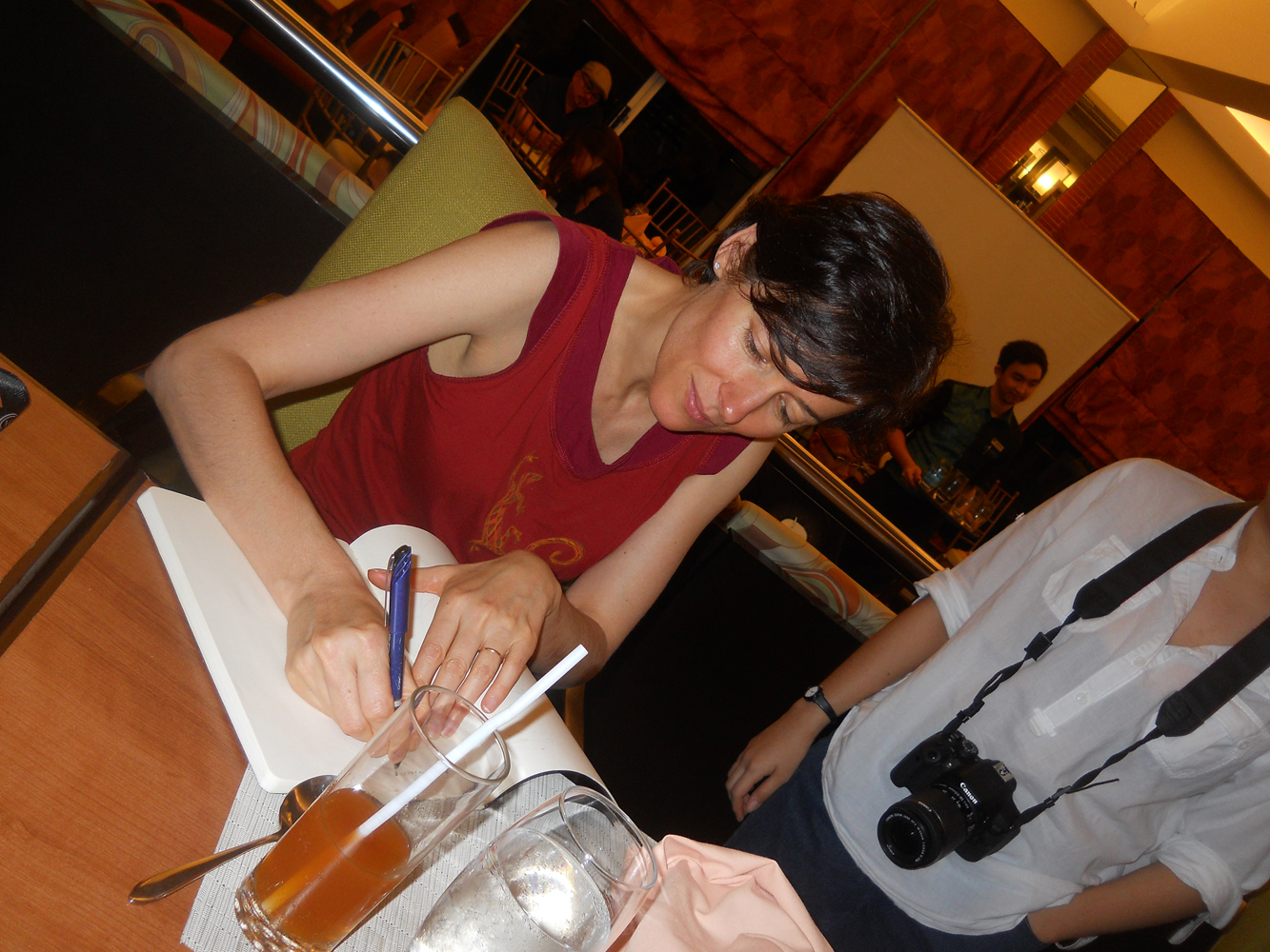


Dinner with CSB Faculty and Signing
![]()


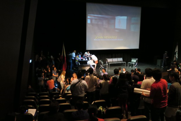
June 27, 2015 (9am to 5pm)
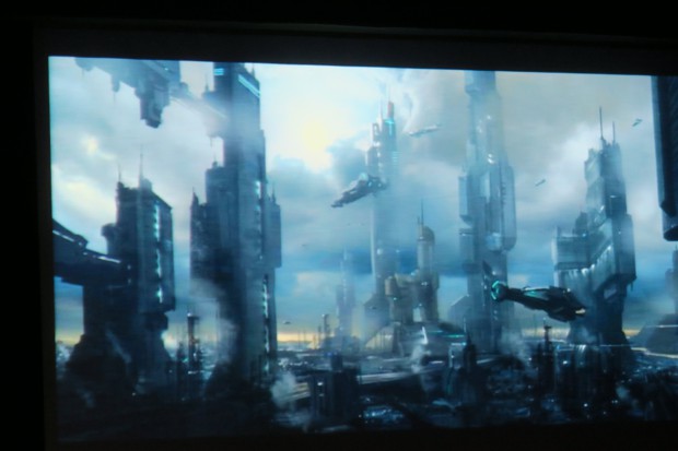
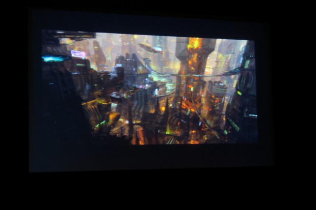
1) Ben Mauro – Concept Design & Digital Sculpture for Film
Ben Mauro -Film Concept Designer and Digital Sculptor
Ben is a concept designer and digital sculptor and his talk is more about what one needs to make it in the animation industry. He was interested in video games and films but his dad wants him to be a doctor or lawyer, a profession more dependable and stable. In his odd jobs in a pizza parlor, gym or dish washer during high school, he needed to do something more creative and his passion was video games. So he researched the Seattle School of Art and applied for a 3D Animation program, but he admits that he was a bit late in compiling for his portfolio which was only in his junior or senior year in high school. At art school he realized he wanted to design things, so he did research on the Art Center School of Design in Pasadena, California and applied for their Industrial Design (ID) program. The school told him they can’t let him in the ID program but allowed him to their Illustration program. After a semester, he shifted to ID. ID gave him perspective, drawing skills where he can draw forms from imagination without any models, pictures for reference.
After college, he worked with many companies for years rather than just weeks to learn more about the craft, develop the skill sets to solve problems neatly and have a firm foundation to have more professional growth. He recommends two books as reference for a good drawing foundation: “How to Draw” and “How to Render”(I was not able to get the author/s of the said books). Influential designers understand form and do their work from scratch at the highest level inspires him. Some of the influences in his work are Japanese comic book artists and writers, such as the creator of Ghost in the Shell, Appleseed, those organic robotic design is unmatched. The American designer for Blade Runner and Tron who also went to Art Center College, who is now in his 80s who still does his work in paint brush is a goal for him to achieve. Other influences are some American classical illustrators, creative animators and painter such Sargent and French comic artist Mobius.

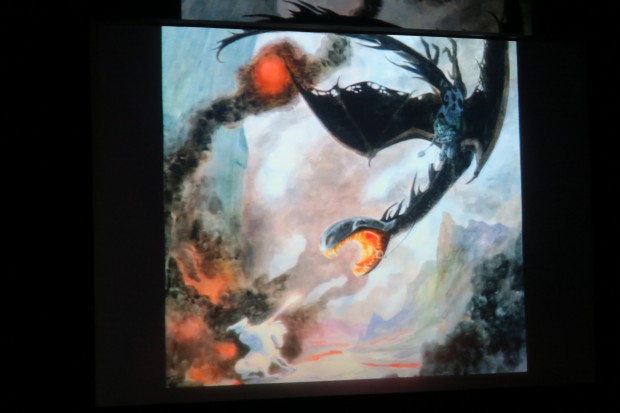
Some of Ben’s Influences
Some of Ben’s early works were pencil drawings from scratch as practice to make glass look like glass, steel look like steel etc., the exercise enabled him to learn a lot. In production work for films, the 2D artist needs to be accurate and detailed as it will be passed on to the 3D artist and then to someone else who will build it. Films need more details and be more specific such as what type of cloth, button, etc. is the person wearing. 3D designers need to know the designs inside out from the skeleton, skin, muscles, skin textures to work form all angles, it should be able to render very detailed and not vague outputs.
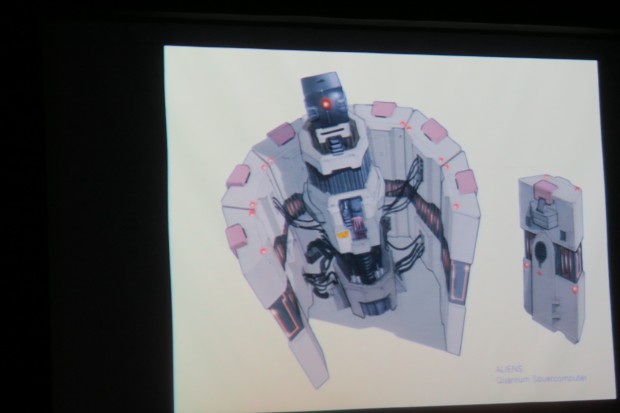
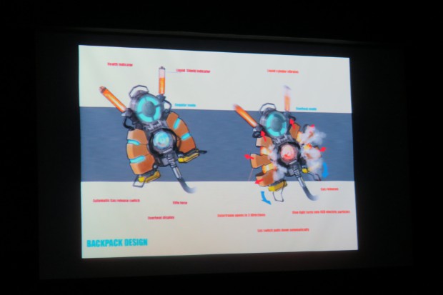
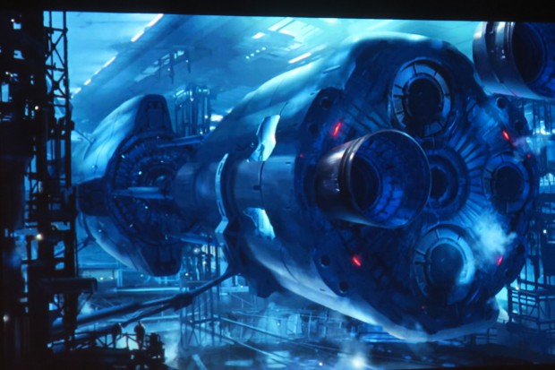
In the film Hobbit, he worked on wolf and dragon like creatures, shields, arrows and some costumes. There will be hundreds of drawings but one or two designs will be chosen, sometimes no design will be chosen. For the said film and other film, television and video game projects, he worked at Weta Workshop in Wellington, New Zealand from 2009 -2013 for less pay compared to the US, but he needed to learn what things he need to learn and after achieving it he left for other projects. In Elysium, he was the designer for the early exoskeleton. He needed not only provocative paintings but also very detailed illustration for grenades, spaceship robot designs etc. At the same time he needed to do rough sketches very quickly. As illustrators, he works with model makers who should be able to interpret his drawings clearly. Production work is solving problems and one should be able to explore all types of stuffs both the good and the ugly. He showed an example of the ugly stuff where a face has been blown off by a shot gun, so he has to do a lot of research of what would a shot gun blast do to the skulls, muscles, teeth, blood etc. In the film Lucy, he was given the description by the art director to make the scene of the drug going through the veins as “painful but beautiful”, so it took a lot of imagination to make it a reality. Other things he did for the said movie are future computers, energy flowing in the and around the body. In the film Amazing Spiderman 2, he did the design for the Green Goblin, grenades and other stuff. Ben also did some work on the game Call of Duty. The design for films takes many months of effort but the final footage in the film of what you work on will only take a second or less to be shown, so its a very wasteful process.
Ben also worked on short films such as Leviathan as a costume designer and Precinct 114 as a production designer, where he worked on costumes, guns and gadgets. The latter film is one where he negotiated for a percentage of ownership, so that he could have more income. Then he worked on a personal short film, wherein he did the sets and basically almost everything else. Ben said his personality is that he always needs to learn more about pencil drawing, illustration, 3D, mixing 3D environments with photography, painting etc. On final note, he said an in-house production designer hired for original designs gets about $200 – $400 a day while a freelance designer gets around $500 – $1,000, as one has no insurance and medical coverage compared to an in-house designer.
Contact: http://www.artofben.com and benmauro.blogspot.com

 Ben With Students During a Break
2) Charles Lee – Cinematics Game Design Techniques
 Charles Lee – Game Cinematic Concept Designer
Charles is a Korean-American who graduated from the Art Center College of Design with a BA Illustration and Entertainment. He currently works as a cinematic concept artist at Blizzard Entertainment. In the past he also worked with many other game studios and his game credits include World of Warcraft, Starcraft2: Void of Legacy, Overwatch, Lost Planet 3, ALIENS rpg, Gotchaman Film, Fire Fall., Medal of Honor, and God of War.
Game companies are very selective who they hire. A new hire is usually a contractual who is on probation for 4 to 6 months before being officially hired. As the environment changes, so does the game companies – at Blizzard before they hire those who are good at realistic art or hyper real, now they are changing directions, of the 12 new recently hired, 9 came from Dreamworks, which are more 3D cartoon oriented artists.
At the game Starcraft, he did preliminary designs up to the final designs. One needs to have multiple set of skills; but one needs to specialize but at the same time one has to be able to cover a lot of different styles. For one concept painting for an environment, the producer needs to see the overall mood, so multiple shots for the interior as well as the exterior mood will be needed to be shown to the producer or director.
For a 4 minute trailer, there can be as much as 4 directors, so one has to talk to many different people and all will have different feedbacks. It is very hard to please everyone, it is a difficult process as one can start all over again if they don’t like the output. Charles need to also get the approval of the game team for the trailer, so he asks for their ideas, sometimes the team doesn’t like the presentation as they say the design doesn’t look like Starcraft any more. So Charles has to photo paint over his work and show a new design 2 to 3 hours later. Sometimes he creates map paintings, color scripts which are easier than pre-rendering concepts. In games, color scripts are very limited and difficult. Every panel is treated as its own story. At Blizzard, story telling is the priority and not design and production.
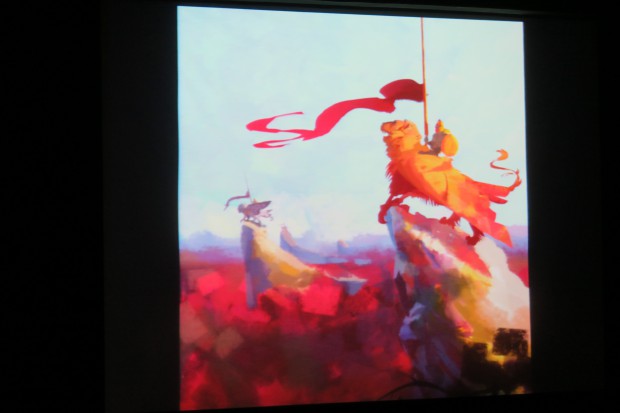
He advises to have a certain skill set and the personal style will follow. Focus on the foundation built for the basic skill set. Prepare a balanced portfolio, this will help the art director know where you can be deployed. In one company, the 3D artists were rotated for 2 to 3 months at a time as a 3D Concept Artist ( a top position for 3D artists), in this process they learned from one another, 3D artists learned from painters and vice versa; one has to know everything. Charles occasionally does speed painting as an exercise but not as many as before due to his busy schedule. He knows someone who thinks for 10 to 15 minutes before starting to paint, after which he paints a lot faster compared if he did not give time to think a few minutes before painting. For every step, there is a struggle on the different stages at work and career. Some people like to use a photo as reference but a photo can only use a certain look, but a photo is just a tool, one can blend a photo with a painting process. Charles likes to do personal painting and he always learns something from it. Some of the personal works of Charles are shown below.
Contact: cidesignstudio.blogspot.com
Speed Painting Done 1 to 2 Hours
Speed Painting Done in 4 to 5 hours
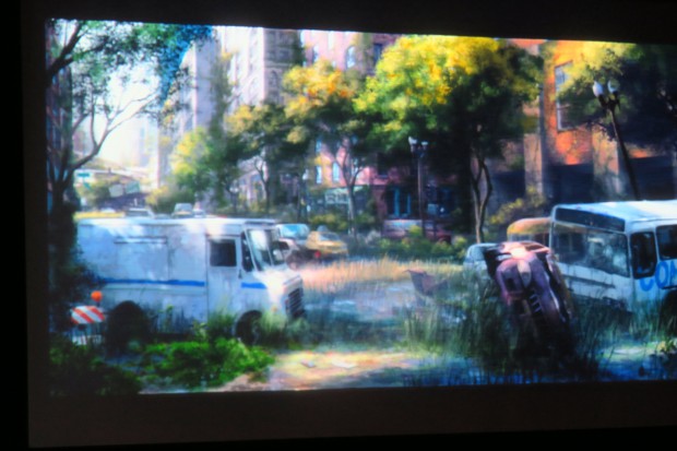
Photo Reference


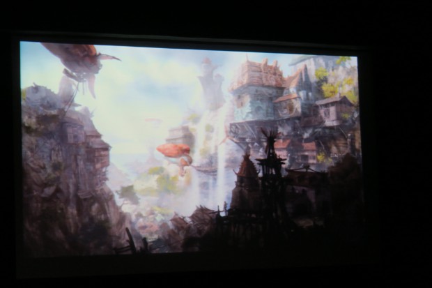


3) Noëlle Triaureau – Art Directing Colors for Animated Film
 Noëlle Triaureau – Animation Production Designer and Art Director
Noëlle is a Production Designer at Sony Pictures Animation and she is currently working on a Smurfs movie to be released in the summer of 2016. She worked as a visual development artist in Surf’s Up and Cloudy With A Chance of Meatballs; as an art director for Hotel Transylvania. She graduated with honors in Middlesex University in England and the Ecole de Commerce de Reims in France with a BA in European Business Management and École Nationale Supérieure des Arts Décoratifs (ENSAD) in Paris in 3D animation.
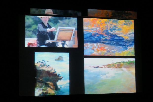
For Noëlle, the best way to learn about color is through oil painting. She shared some of her experiences on working with films where in the Cloudy With A Chance of Meatballs, she painted lots of foods, had several versions of hairstyles for the lead character, and she showed the transparency and translucency of the shoes (looks plain black from afar) of the main character and the level of shine in some of the objects in the film. The crowd models that were designed to be differentiated and at the same time to blend in together so the main characters pop out.
For Hotel Transylvania, there were 6 directors at the start there was a pair of directors, followed by one director, then another pair and finally one director again., so the story had many iterations. The utensils were designed to be weapons, monster foods were designed and other utilities such as skull phones were designed. For the background environment, she showed the transition of human cemetery to a monster cemetery. The trees were based on some ink blotches.
She lectured on a) Color Basics, b) Color Symbolism, c) Color Script. For the Color Basics, she discussed how humans who have 3 color receptors differed from animals such as dogs with only 2 color receptors, wherein it only sees in black and white with different tonal values. But sparrows and most birds have 4 color receptors, butterflies have 5 to 6 color receptors and the highest one was the Mantis Shrimp with 16 color receptors. So the animals have a very different way of viewing colors compared to humans.
Noëlle showed how complementary colors, double complementary colors, the use of similar colors and 3 colors are used in animation and paintings to bring out a beautiful effect. She used examples in the films she worked with and showed the oil paintings of Danish, French, American and Russian masters to highlight the effects of colors compared to when the paintings are just shown in black and white, which most of us would not really appreciate much compared to the colored ones.
For Color Symbolism, there are meanings and emotions evoked of how colors and variations of those colors are used. Colors can point out the good and bad guys. Examples such as the blue color; it can evoke tranquillity, coldness, comfort, health etc. but in Mexico it means mourning and in some Eastern countries it can be a sign of immortality. For the green color; it can signify money, life, envy, guilt, hope, luck etc. In South America it represents death in France it is illness. For yellow; it is sunlight, energy, creativity, etc. In France it is jealousy and in some Eastern countries it represents sacredness or being imperial. For orange; it can mean warmth, pride, ignorance etc. For red; it is blood, heat, strength, anger, danger etc. For some Eastern countries it is a symbol of luck, prosperity, power and in some African countries it is a sign of mourning. For purple, it is dream, magic, old age, royalty merry, nostalgia, sorrow etc. In some Eastern countries it is a sign of wealth. For black; it is power, supplication, etc. In the West it could symbolize death, evil and grief. In some Eastern countries it could mean wealth and health. For white; it is a sign of hope, light, purity, joy, faith, winter, cold etc. For the West it means good, for some Eastern countries it is a sign of death mourning and sadness.
For the Color Script, there are color bars above the story board or film sequences. The different sequences show the mood of the story, as the story progresses there is warmth, love, depression etc. So the color of the scenes is matched with the color symbolism of the color bars above film sequences. Noëlle showed the color script of the film Cloudy With A Chance of Meatballs – Making of the Color Script see at Youtube wherein the production team was able to match the color bars with the sequences.
Her final advice to learn more about colors is to go outdoors, copy the masters, be creative, daring and do real life drawings/paintings.
Contact: hubcap10.blogspot.com

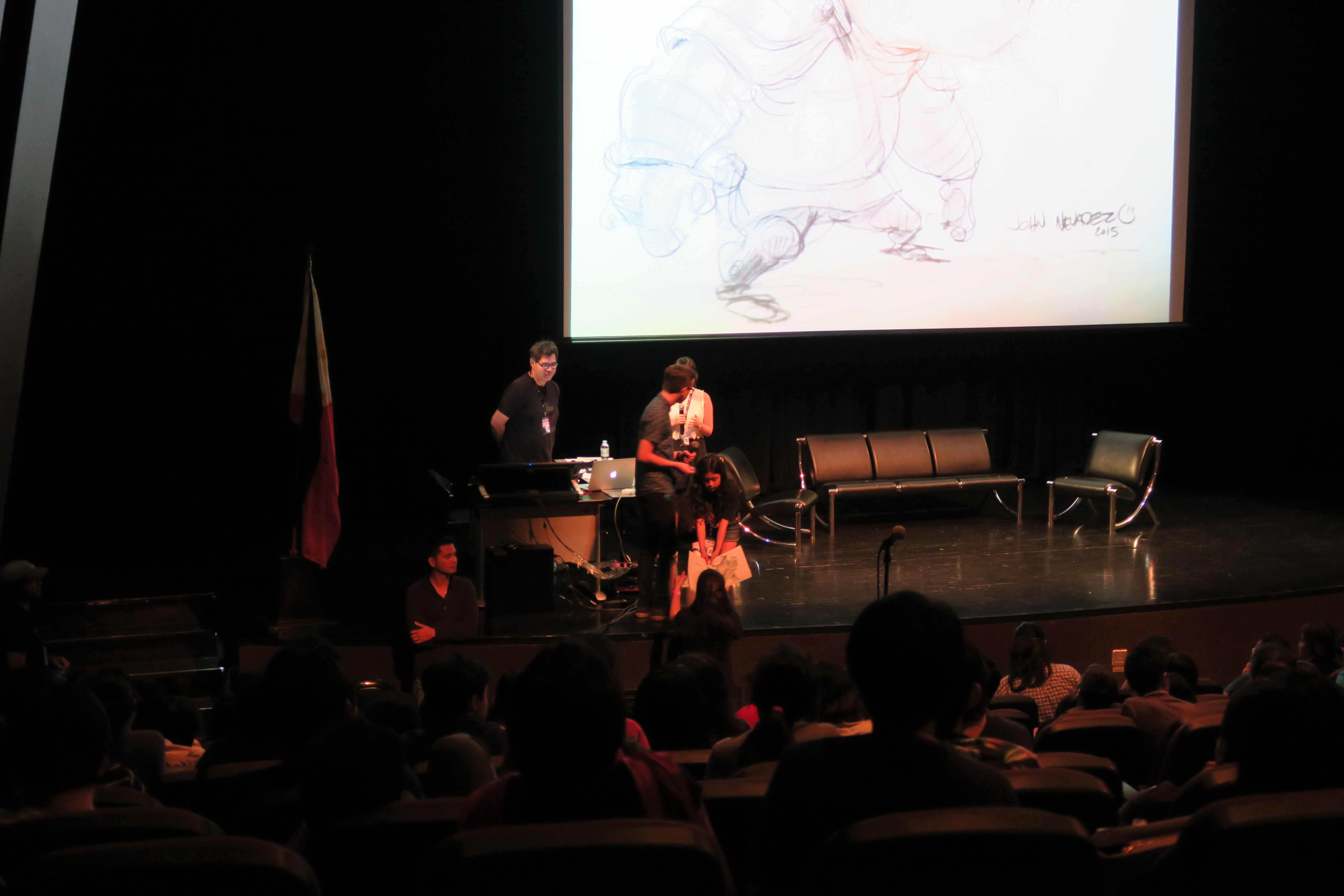
4) John Nevarez – Concept Design Over Traditional & Digital
John Nevarez – Animation Environment and Character Designer
John has been conducting lectures and demos all over the world and have in both feature and television animation projects such as Monsters University, Cars 2, Astro Boy, Tinker Bell and Kim Possible. He also teaches online at CG Masters Academy. He graduated from the University of California Santa Barbara with a major in Art Studio.
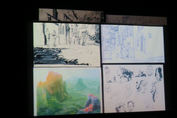
For John it doesn’t matter whether one uses traditional or digital, just as long as the work gets done. He narrated how he did the university gate design at the feature film Monster University. At first he looked at the story board then the early works of other artists. Then he converts the human elements to monster elements by adding some teeth and spikes at the gate with the early sketches. All the elements at the Monster University were taperish, heavier, thicker, has a very solid foundation and there are big doors and small doors for both big and small monsters. John together with some artists also went to many Ivy League schools in the country to look at the design and details of the iconic gates. There were many sketches until the director had a particular choice and from the choice they further honed the design and added hidden eyes, fangs and teeth on the gate. They used different approaches, studied every detail from the logos, letters, statue thickness, the thickness of the columns where the statue stands on, door knobs on the gate, size references by putting sketches of cars on the gate. Research for believability.
For Kim Possible, he googled for architecture in the 50s and looked at early Disney posters. One inspiration for their Mexican hat style restaurant was shown in a picture from real life. There were many exploratory designs. Think about the character, who they are, how do they think, what do they feel. Think with your pencil. Draw with the story in mind. For drawing people, use grids, use simple line of action first, show the dominant line of action of what the body is doing, for example a man is kicking a ball start with an L shaped line. To get more ideas, just look outside into your city, use your experience there.
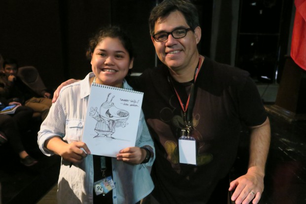
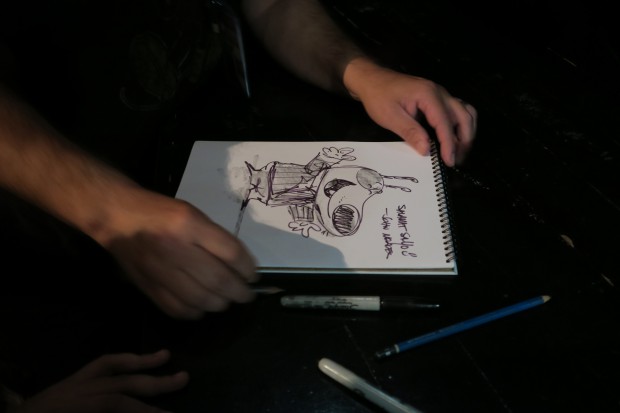
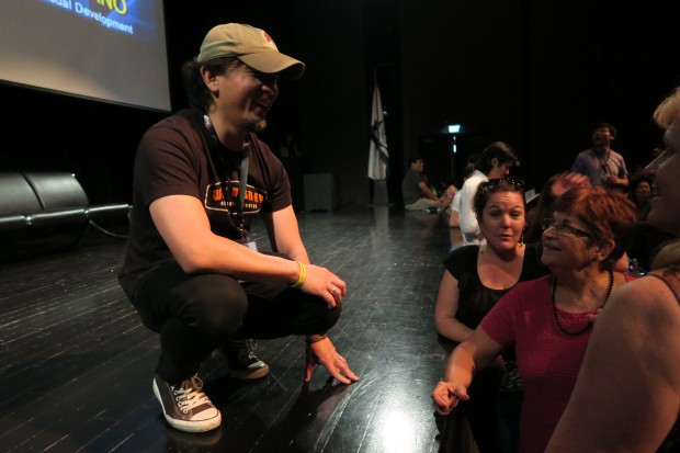
After his talk, there was a 10 minute break; there were lots of students who lined up asking him to sign his name on their posters, notebooks etc., but there were some who asked John to draw on the spot for them which made the line longer. Unfortunately for those at the back of the line they have no way of knowing that John is making quick sketches for some of the people at the front. John also raffled 8 of his quick drawings to the audience during the intermission times, some of those drawings are shown below.
Contact: john-nevarez.blogspot.com


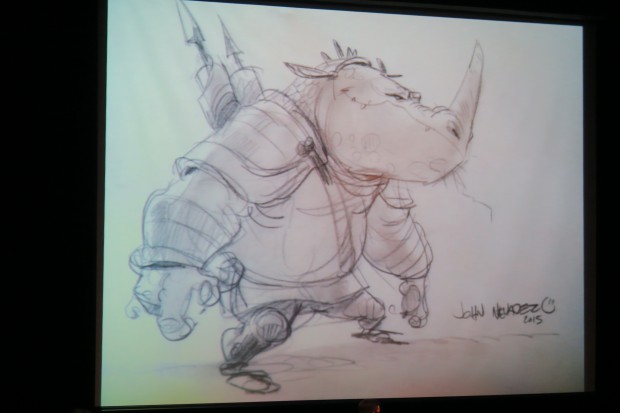
Some of the Raffled Drawings


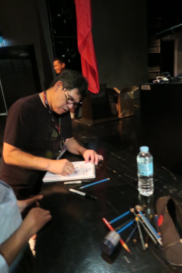

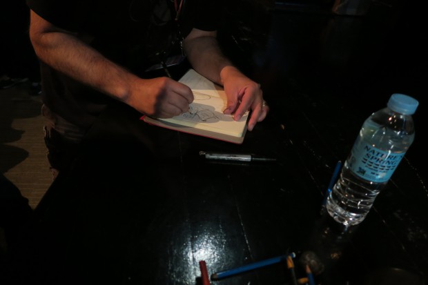
Another Notebook Being Drawn
Long Line for John
5) Armand Serrano – Making of Big Hero 6
Armand Serrano – Animation Environment Designer and Visual Development
Armand has been in the animation industry for 25 years. He graduated from the University of Santo Tomas in Manila with a degree in Civil Engineering. He started his career in Manila in 1990 by joining some American studios making 2D cartoons for Hanna-Barbera and Marvel as animator and supervisor in various capacities. After some years, he immigrated to the US and worked for Disney in some 2D films. From there he went Sony and to Disney again in some big feature 3D films. He also works as a freelance artist.
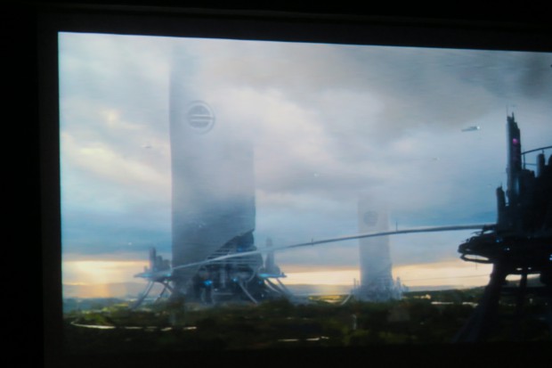
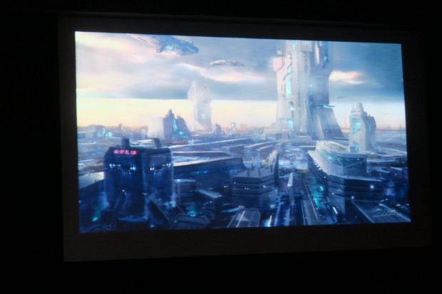
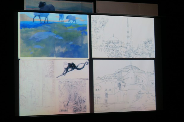
Armand was supposed to talk about Lighting and Tonal Values in Animation, but since the topic has been covered by Noëlle, he changed his topic to the Making of Big Hero 6 film. When Armand was asked to be a Senior Visual Development Artist for Big Hero 6, at first he did not know that it was based on a Marvel comic book series. He explained that films should have three elements: compelling stories, believable worlds and appealing characters. Looking at the storyboard, the setting was in San Fran Sokyo, a fictitious hybrid city of San Francisco and Tokyo. Looking at the early posters made for San Fran Sokyo, there were many Japanese elements in terms of colors, lettering and design that was mixed in some iconic San Francisco landmarks and tourist spots such as the San Francisco bridge.
Armand showed the evolution of the costumes and the inspiration for the robot face. He did some research playing around scenes and drawings with with different times of the day, morning, mid-morning, noon, early afternoon, night time. Aside from the lighting, the tonal values are also studied whether they are monochromatic or colored. In one panel of the story board, he showed the relationship between the characters Hero and Tadashi. It was just a small board – he emphasized that “if it works small it can work big.” At first, the scene was a rough sketch with some tonal and lighting. He separated the characters and started painting and do some value checking of tonal values. Then he did some painting again until the final version. After the final version, he did some value checking again of the tonal values. So there are three steps, initial, middle and final version. The final version is different from the initial version. Values are the lightness and darkness. For the colored version check the values, desaturate it, it shouldn’t veer away from the tonal value of the thumbnail sketch.
In one scene of the film, the art director told Armand to make sure the house of the character smells money, since the character is a rich boy. Armand did a quick sketch of the house and backyard after some research from many mansions and vegetation in the San Francisco area. There were many versions of the backyard as one sketch showed that it is too open and the other one is too enclosed. Armand also plotted where the different scenes would take in the backyard to show the director on how it will look like if its near the fountain, overlooking the ocean, in front of the manicured trees, etc.
In visual development, Armand showed how the modelling of the characters are done. He showed the characters side by side, turn around, top bottom, facial shots, etc. Then the SIM set-up is drawing over the character, how the baggy pants would be, what would they wear, shoes, jeans etc what they wear represents their character. Then there is the mapping of clumps of hair for the character, where each clump of hair is divided into the different areas of the head in 3D. They have a hair department for their characters, since clumps of hair for one character act differently, if the character is driving, swimming, walking, biking, falling etc. The movement of the hair should show realism and not just be static or unnatural.
There is also character rigging, wherein all the moving parts of the character are shown and checked in the computer model. So that means every joint, skeletal movement in the fingers, muscles on the face, eyes, eyebrows, every fabric, leaves of trees, even smoke should be rigged to appear natural looking when moving.
Layout – staging the scene, shot by shot, panning, tracking, moving 1st to 3rd pose. Laying the elements of the background which has to work with the characters’ layout. The layout pass are the basic 3D moves, should show major moves of the characters not in the storyboard.
Animation – showed the 2D face expressions then made it into 3D. The line up of the 3D model of the characters were shown while walking and how they sat on their chairs showed their mannerisms. Technical animation shows the complete character performance, hair, clothes, etc. Put different timing on clothes by drawing over the 3D by 2D as computers still need the human touch and feel in terms of movement.
Effects- in one scene, the microbots behaviour was shown by creating a non-existent bridge. In another scene, a building exploded, the explosion showed the debris, glass, furniture, concrete, etc. in many pieces. Armand showed it in slow motion and said that the explosion pieces totalled 250,000 pieces, as to how they rendered it, it was not explained. My guess is each piece was rendered one by one.
Foundation Lighting – different locations (Iceland, LA, Kenya, China,etc) has different types of lighting, so does different times of the day. The atmosphere is localized, so there is a different emotional tone for a location. Should show thumbnail of different lighting.
Even the crowd or extras in the Big Hero 6 film has a name, different movement, behaviour, height and look. The Tangled film has about 150 characters and progressively up to the Big Hero 6 film, the number of characters reached 700.
Rendering – there are many sources of light say in a room (window, lamp, reflection or bounced light, from the TV, etc), so the scene should show the bounces of the indirect light.
Contact: armandserrano.com
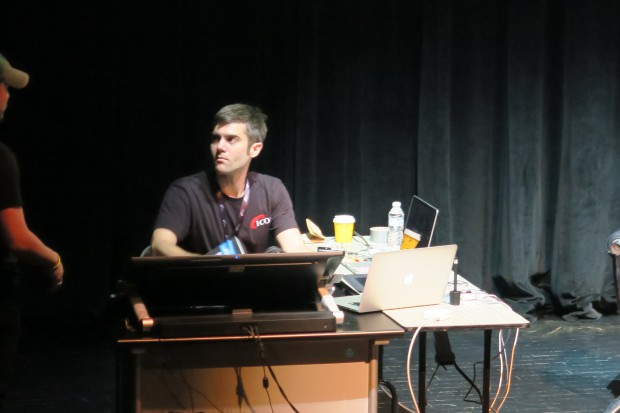
6) Open Forum


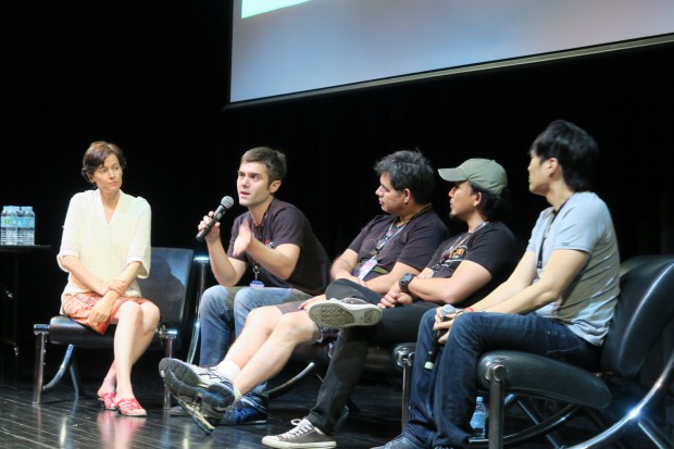

I did not stay for the whole duration of the open forum, nor did I take notes of all the questions and answers given. Here are just some of the concerns and answers given:
a) To be specialized or to be generalist – ask yourself what you want to do, make yourself a generalist but have a specialty, the more you can do, the more job options you can have. Be as good as the guy you admire at Pixar, Disney etc., your work should equal or be near your idols quality if you want a job at top companies. There are only few top notch people in their specialty, so it is not advisable to aim for that unless you can equal or be near the type of work that they do.
b) 2D or 3D – it is true that 2D is waning, but in Europe there are still lots of 2D. It’s like a question of electric or acoustic guitar, its just a tool, which do you prefer.
c) Sometimes the director does not know what he wants – you have to ask leading questions diplomatically and professionally. Start with a reference, ask leading questions, hone it, find a target.
d) Having an art block – do things differently, walk away, animation is a teamwork, ask or talk to some of your team mates.


Leave a comment