Realistic Poster

19 02 2013

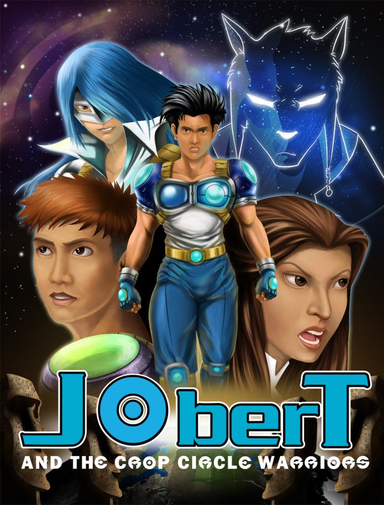
The sample realistic poster  for Jobert and the Crop Circle Warriors was the result of many months of trial and error from many new artists and the director’s various study samples. It was very frustrating, as it was just a poster and it took many revisions and studies to have the final output. Even the final poster is not exactly the way I want it to look, but it is good enough as a sample poster. The concept is clearly shown and the rendering is also good. The most difficult part was deciding how Jobert should look like. We cannot just make the face look like a popular local actor, so we kept on changing it, but it still doesn’t look as good as it should. Anyway its just a sample poster, the face could be changed any time if we want to.
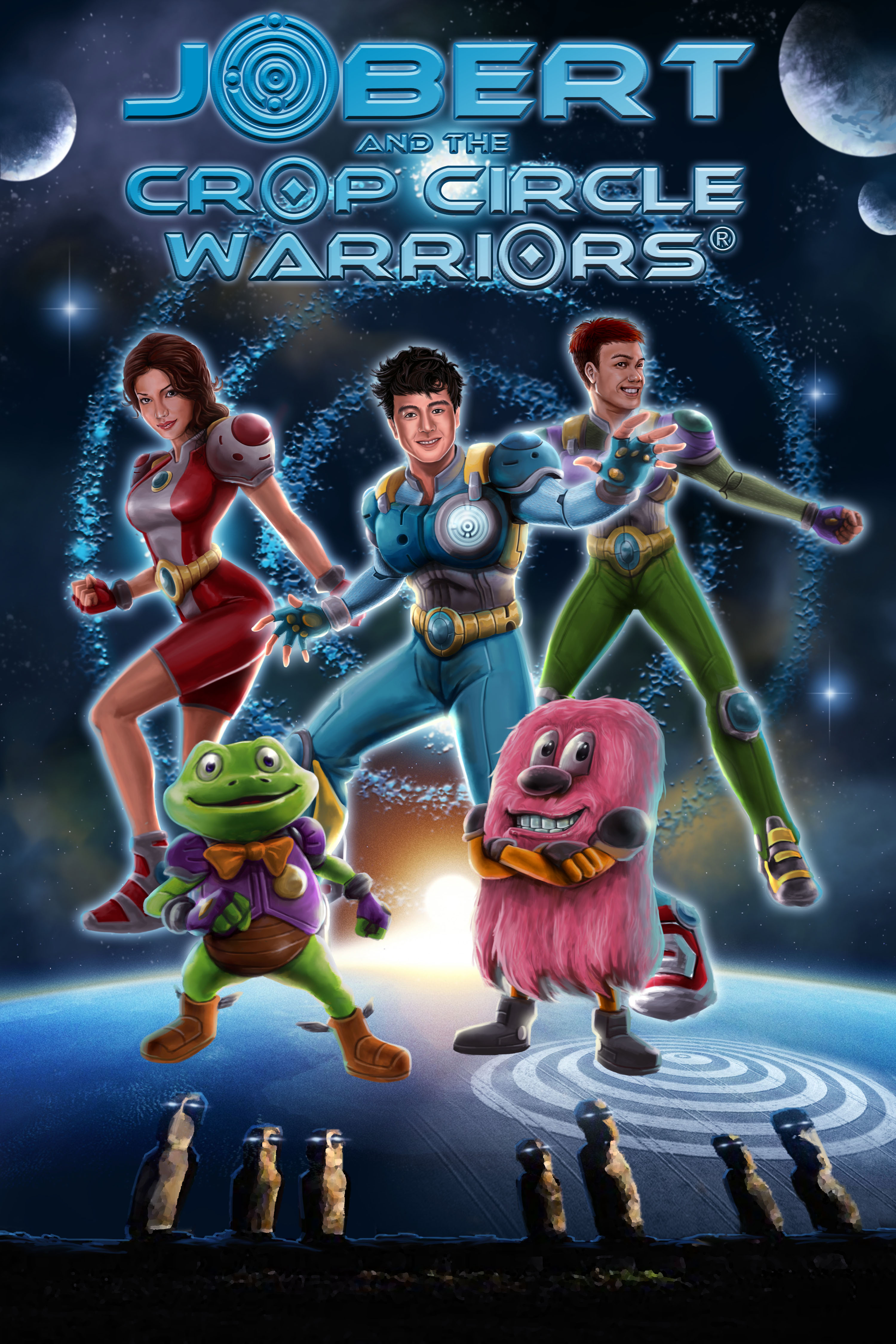
Jobert Poster 05-1

Final Sample Poster

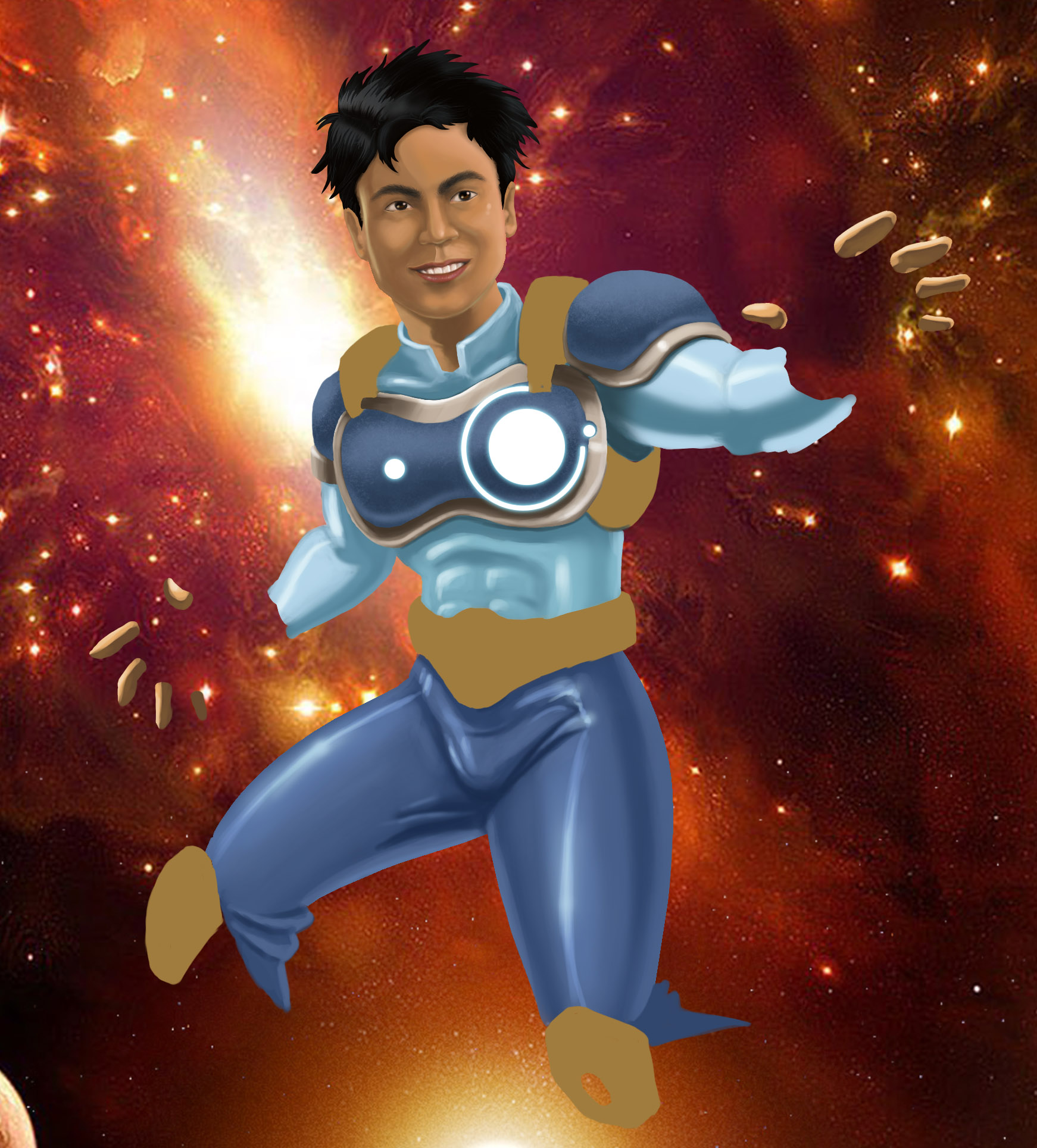
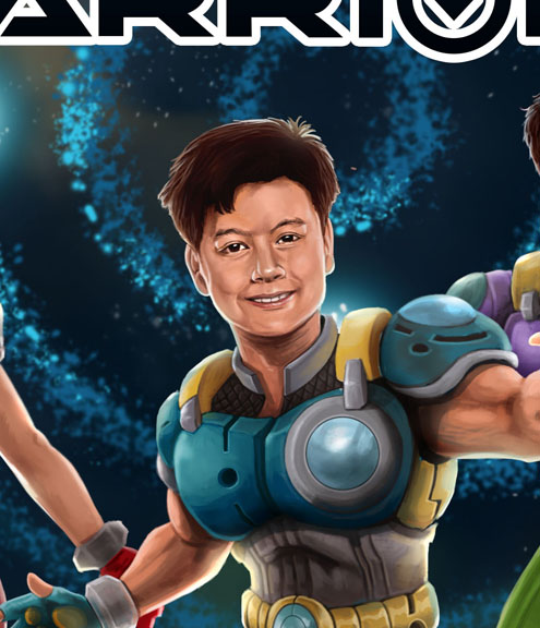
Below are the various faces of Jobert that we were trying to finalize, even the final one was not exactly what I had in mind, when it was colored the face changed.
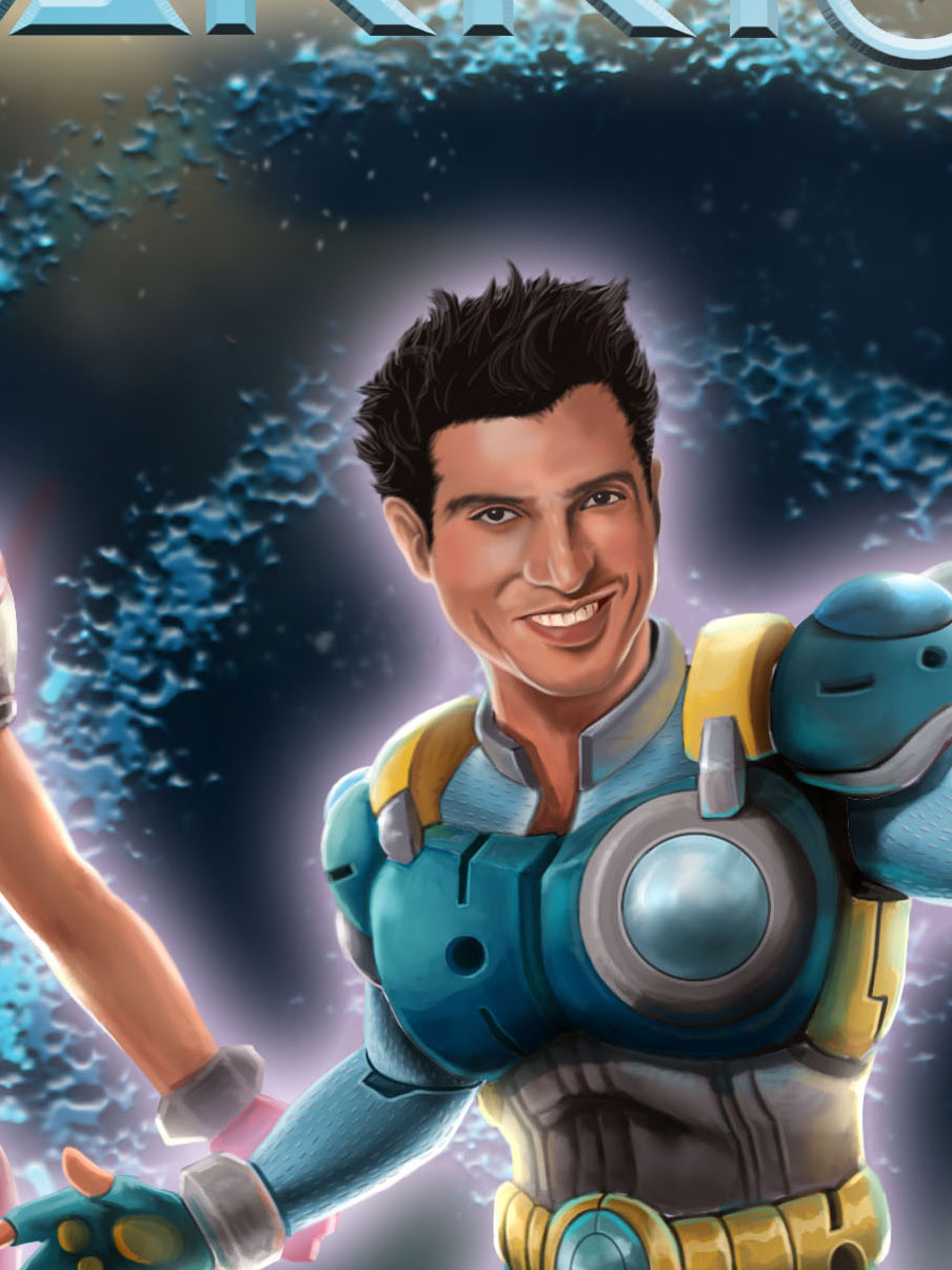
Jobert Face 02

Jobert Face 03-1

Jobert Poster 05a

JobertPosterDetail

faces

Jobert Face 02 copy

Jobert Poster Sketch copy

Various Jobert Look

The posters below are just some of the studies that the director sketched and the colored ones are the work of some of the artists.

08 jobert poster

09 jobert poster

10 jobert poster

Jobert Poster 01

06 jobert poster

Jobert Poster Sketch2

jobert poster_revisions 2

jobertposter_revisions

jobertposter_v1

JobertPosterSketch

Jobert Poster progress 0713

Jobert Poster New

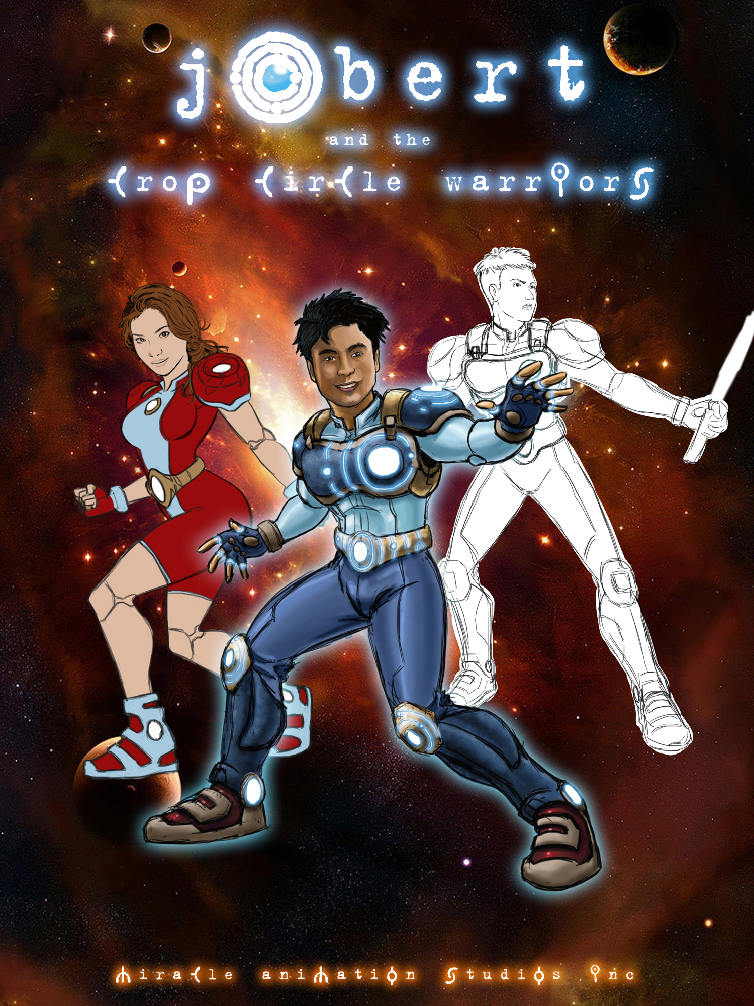
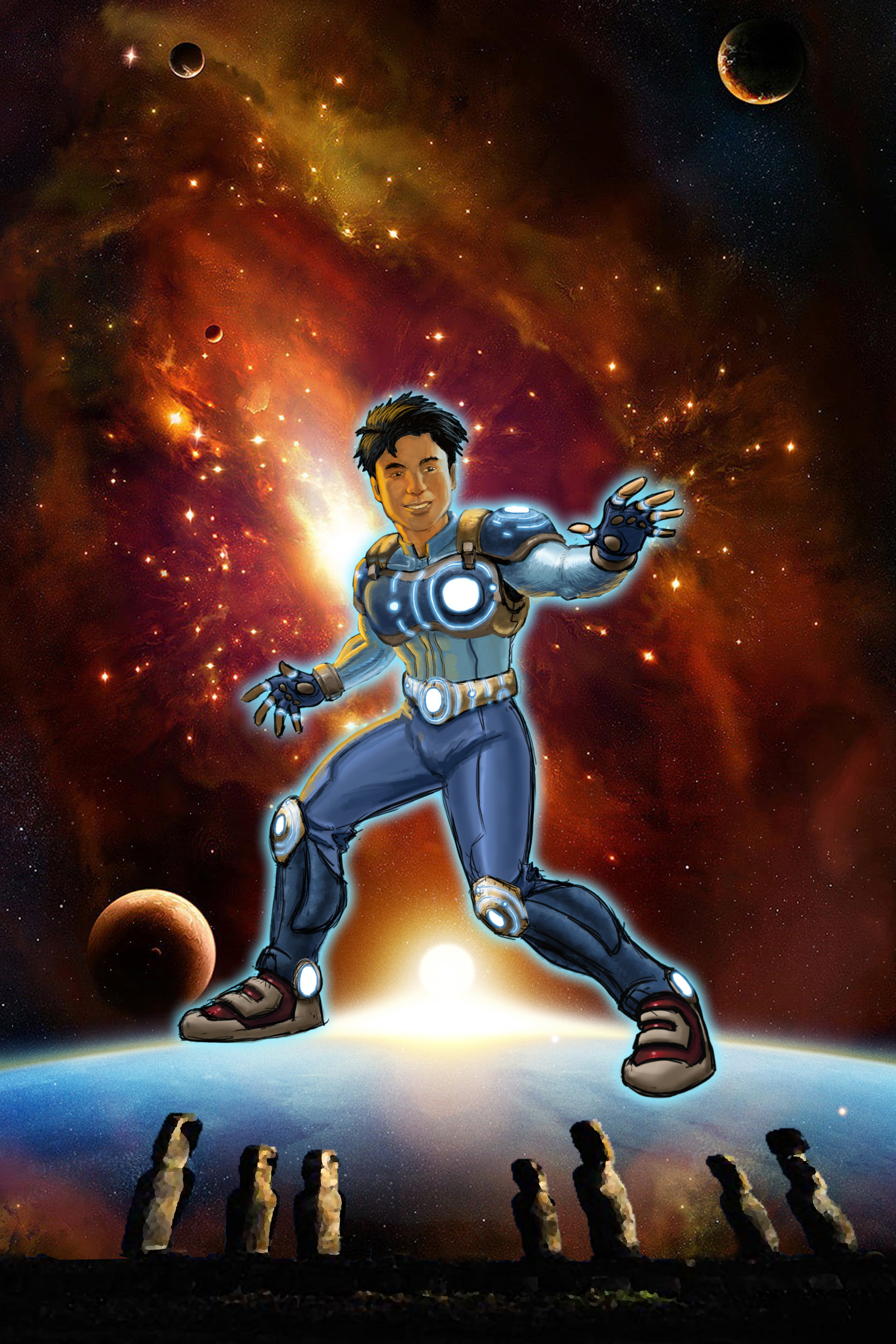
Various studies of posters

There were lots of studies and typographies, as back then we were still not sure of our final concept and typography. We hired artists who were not really seasoned but who acknowledged that they could do the job. I gave the director some guidelines what the poster should look like and the director lets the artists have a free hand in executing it. After weeks of waiting, the artists could still not show any progress with the poster, if they did, it barely showed any promise of being a good commercial art work. The director finally was the one who finalized the presentation and look of the poster. The chosen artist all now had to do was color  the poster, but several artists who agreed to do the job fell very short of our expectations and some did not even bother to reply back on what was their progress. This happened about four times and it took weeks to find another artist who was willing to do the job for the budget. Some who were capable were too busy or found the professional fee too low for them.
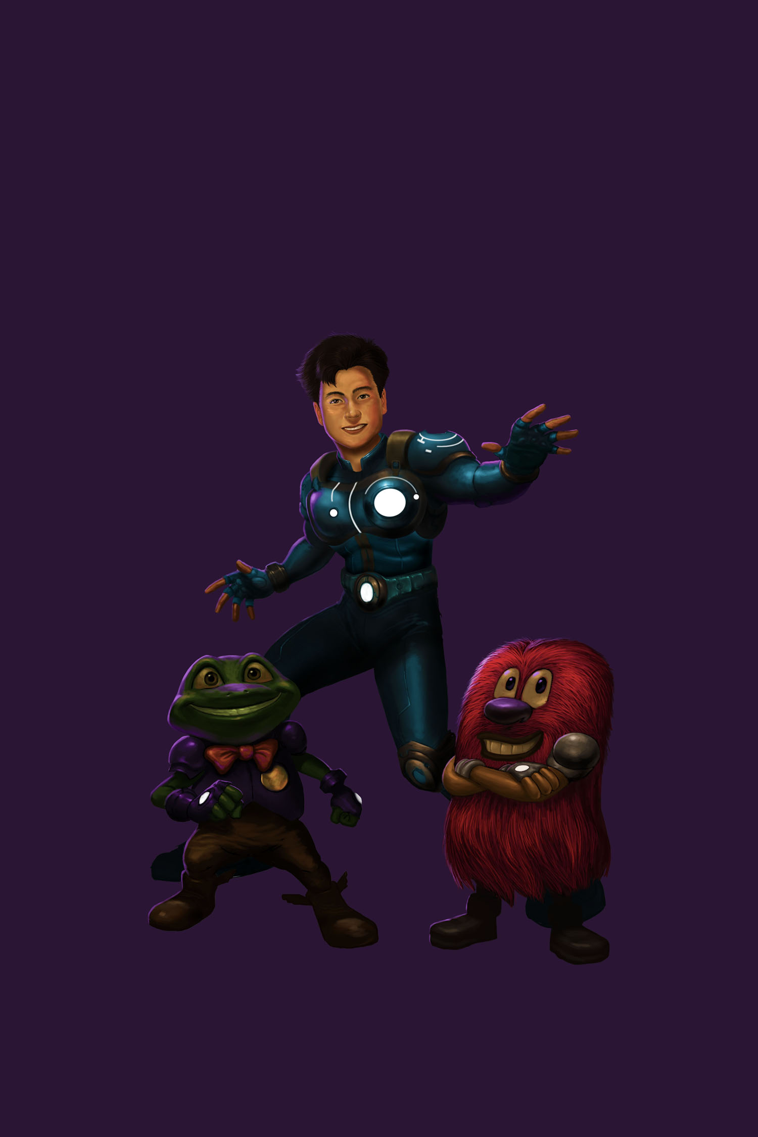
03 jobert poster

13 jobert poster

Samples

After months of frustration, the director was finally able to get hold of a former artist of the studio who now works as a freelance artist. It took time to contact him,  and the only time he responded was when we finally agreed to his professional fee. After a week, there was fairly good progress, but he needed to be guided as he was changing the faces without being told to do so.

Jobert Face 01

Sample

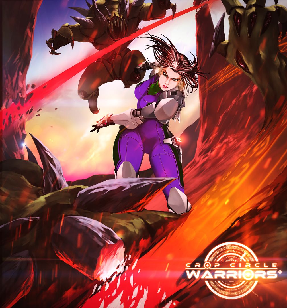
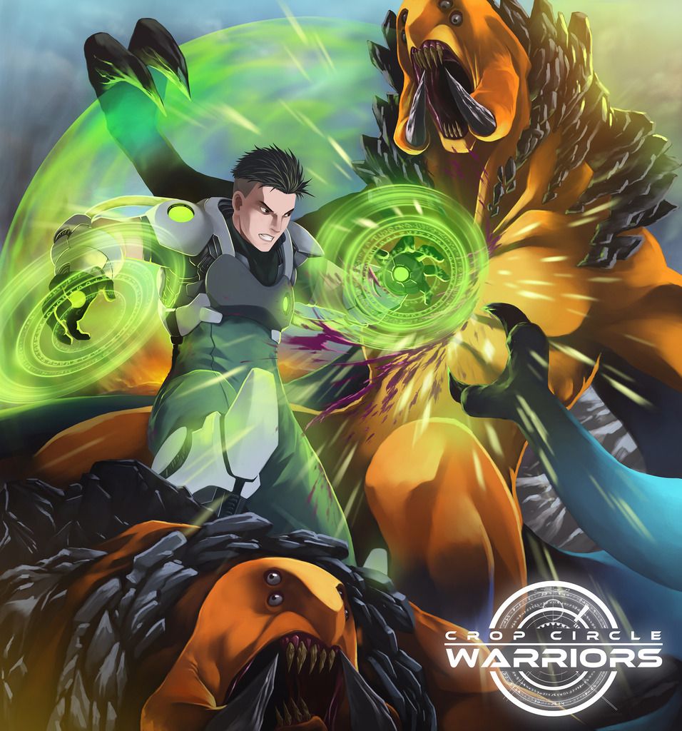
The poster is just a promotional tool to expand our property to other media, more specifically in films. However, our property is still very far from realizing a live action film project as there are still many hurdles before that can be realized. But there is no harm for aiming for something bigger in the future. The aspired film needs a good script that will entail a substantial budget, so I’m open for option fees, film rights and television rights to the right producer/s who can take the property to the international market at the right time and for the right price.

After the poster, the next in line to be finalized are the first season episodes and pitch bible for the said season. The second season script, pitch bible, character look and android game will be finalized while the first season animation is being marketed.


New Introduction

5 02 2013

    The new and official introduction for Jobert and the Crop Circle Warriors© was finally posted on Youtube last night. It took us several months to finish it, since we were also simultaneously finishing the episodes and there were some conceptual and production problems. It was relief that it was finally done and we could move on to other things that need to be done before we can submit it to our broker who will market it to the international distributors.  This time we are making sure that we do all things properly to eliminate possible sources of rejection from the distributors.

      At first I was hesitant to do the new introduction, because I was kind of comfortable with the old one already. Why rock the boat, its okay already? It was really difficult, because I had to set aside my ego, my comfort zone and I have to shell out money again to make a new one.  Alstaire did much of the old intro based on his artistic inclinations, while I added some inputs and for a time I thought that was already a 3 point shot for our project. We have to learn to make it the right way based on the comment from one multi-awarded producer/writer to Alstaire in a foreign exhibit. When he saw our old introduction, he was puzzled. He asked Alstaire blankly: “Is that your final intro?” Alstaire replied tentatively and said; “Ah er, no.” Although Alstaire had no idea of how to do a better intro nor there were any plans to do a new one.  Sensing the uncertainty in the reply, the producer authoritatively replied back; “There’s a formula for that.”  From there, we had to do some research and it took me a few months before I even started to write the new intro because I need to think of a concept and I had only a few ideas that didn’t inspire me. And it took another few months before we even started to do the story board. It was really inertia on my part, because it involved changing our mindset of what is right. We thought art is art, there is no right or wrong, its just a matter of personal preference. The intro is not urgent, its not that important anyway – was the kind of thinking we had. Of course in the end the multi-awarded producer was right and we were dead wrong. Thanks to him, we now have a new way of thinking for our whole animation project. It moved us to the right direction for better stories in the future. Nobody except him mentioned about this, not our broker, nor any of the other potential distributors or commentators from our old introduction in Youtube.

     The first draft for the introduction was a disaster; I could hardly understand it, even though it was based on the story board we all agreed upon. I really got angry with the director and the co-producer, as the project looks like it was  going down the drain because we can’t produce a good introduction. At that time I had no idea how to fix it, but I later realized that I was not 100% sure  of the concept, so I just let the team do it as they see fit. If I’m not 100% sure of the concept, the team naturally had no clear idea as to what I really wanted. I left the team alone to do what they think is best, based on the story board. So they had their own ideas of presentation and drawings that were very different from what I had in mind. I thought , we could just do it like our Original Bill Board (OBB), where I just added my inputs later on for improvement. I was wrong to expect everything to flow smoothly this time, as I later learned that we have to be as exact as possible with regards to the introduction.

        Shown below are some pages of the storyboard for the new introduction that still needed a lot of changes.

page1

page2

page4

     I was really worried and anxious that I had to step up and outline the narration with the corresponding images that I had in mind. But before the production even got started, disaster struck as the portable hard disk accidentally fell with all the data lost in the said hard drive. The director also had to attend a training seminar for teaching animation for almost a month for the studio to be accredited by TESDA- a government vocational training center. There were also personal problems that followed the team after that and the holiday season. The delays cost us two months before we could even start the production.

     In the last month of production, I thought I was already 100% sure of my concept, but upon reviewing some cartoon intros on Youtube, I realized I missed two critical areas not in our final story board. I also had to cut the narration to fit in within the standard number of seconds or minutes for an introduction. Finding the narrator was also a problem for the given budget we had, until our director’s uncle was asked to do the part. The music part had limitations based on our outline, as we can’t use the minus one from our original theme song.

     Overall, I’m happy with the outcome regardless of what other people will say, because with the new introduction, we now have a firm foundation to build on our property. We are doing everything step-by-step and it works for us. Without the final title and typography, there is no way we could finish the final introduction. And without the final introduction, we would not be able to do other things such as the sample realistic poster, android games and other properties for the future. Although the official intro in Youtube will still have a correction – namely one character- Jessalaine in one part she still used her original costume wherein her cleavage still appears. We will correct that if the animation is already shown on television.

     There was a lot of effort that we put on the short introduction. Although some viewers, especially the trolls could just dismiss it and say whatever negative things they like. It took me many years to finalize the concept, and I doubt it that any of the critics for our animation can produce an original concept in a year or two that has potential in the market place. It is very easy to think of a new concept, but to produce it and whether they can sell it in the market place is another story. There are a lot of super hero animations out there, so I’m happy to be able to produce a new one for the audience. Further explanation of the concept will be in the pitch bible, the episodes and the prequel and sequels – if any in the future.


Visual Improvements

5 09 2012

There are a number of visual improvements to help market the property. Sometime in 2010, our broker suggested that we cover the cleavage of our female character – Jessalaine , this is so that we can market the property in Muslim countries. But for the local audience and Western veterans in the industry, the cleavage was even an asset to add flavor or character to the cartoon.  But our target market is primarily the developing world, so its okay for us to cover the cleavage and besides if ever there is  a live TV series or live movie in the future, the new design will prevent any wardrobe malfunction. Since we already produced some full episodes then, we had to redesign and redraw the garment to cover the cleavage.

As we refined our concept, the title and typography followed. Before, we just relied more on the aesthetic look of the typography. It was only in December 2010 that I thought of the complete title – a kind of a eureka moment  for me while I was  jogging. But it was a bit too late as we submitted the pitch bible with Jobert as the title  – just a week or two earlier. It took about a day or two to decide which title to use among 4 alternatives I thought of, with the help of our broker. Our broker suggested the title be Jobert and the Crop Circle Warriors since it covers everything.

But even in late 2011 we were not sure what the official title would be as we were still vague with our concept; we were thinking we could use one title for the local market, while another one would be used for the foreign market. Deciding on which title to use is difficult, on one hand we are leaning on a shorter title – ‘Jobert’ like ‘Naruto’. On the other hand, there are few famous classic cartoons with a long title like ‘He-Man and the Masters of the Universe’ or ‘Josie and the Pussycats’.  It was only upon the final refinement of the introduction that I am convinced of using the long title. The typography of the long title could be used in any media, merchandise, promos etc. and will look the same all throughout with no problem. Shown below is the evolution of the typography for the title.

The original typography was done sometime in 2008 for  2 posters and one was used as a brochure also for the Hong Kong Filmart Festival. The three orbs represent the three main characters with the corresponding color of their cyber costumes.

The second one was used for the Original Billboard presentation in YouTube. The letter O is also the orb and it will show the glowing crop circle design of Jobert inside it. It was done sometime in 2008.

The third one is the one used for a poster shown above in Dongguan, China in 2011. At that time, we were still not sure of our typography.

The fourth one is made sometime in 2012 when we were already sure of the title to use. The design was not good enough, so it was scrapped.

The fifth one is the final design – shown used in the old posters above. We could change the typography to any color or a metallic look, which is shown in the sixth or final row.  The new typography is now flexible, it could be used for both cartoon and realistic posters.

The poster below is a scene taken from the final episode, wherein Jobert had increased his power tremendously. It’s a nice dramatic scene, wherein it captures the essence and the difference of the animation compared to other cartoons. Adding the new typography just makes the art more beautiful.


Design a site like this with WordPress.com
Get started